Ovagraph
Ovulation tracker and fertility charting app
Overview: problem
About 10 percent of women (6.1 million) in the United States ages 15-44 have difficulty getting pregnant or staying pregnant, according to the Centers for Disease Control and Prevention (CDC).
OvaGraph app
 |  |  |
The core goal of the application OvaGraph is to make tracking ovulation and other menstrual cycle data easily. A paper version of the calendar is not handy and it is hard to make all calculations on your own. The app helps women to store their data, see the predictions on the peak fertile days. Additionally, this app connects couples trying to conceive on one forum.
The target market: female 20-40 years old trying to conceive.
Pain points
– charting on the paper is very time consuming and complicated
– women would like to get notifications about when the ovulation is about to happen not to miss a chance
– women need a reliable instrument to track their data for them not to lose a single point of data.
Experience Tested
Some users report that the app is not user friendly, it doesn't save the data after it has been entered and it is hard to use the app for those who have not read a book about charting.


Competitor analysis
Mostly all period/ovulation trackers use pink or blue palette. The interfaces mostly are clean and playful.


FIRST TOUCH
Log in / Sign up
General aesthetics
Colors: pink.
Target audience: female, 23-35 years old.
The app looks lightweight and simple to use. Colors typical for this kind of applications for female audience. It might make sense to differentiate and work on the signature style of the app.
Colors: pink.
Target audience: female, 23-35 years old.
The app looks lightweight and simple to use. Colors typical for this kind of applications for female audience. It might make sense to differentiate and work on the signature style of the app.
General aesthetics: 7/10
Log in / sign up
Flow
Log in button is not standing out from all other elements and it is hard to understand what a user needs to do.
Flow
Log in button is not standing out from all other elements and it is hard to understand what a user needs to do.
 |
Log in / sign up: 3/10
 |  |  |
Redesigned version
1. Welcome screen where a user can log in or sign up. It is impossible to miss this step.
2. The app asks a user about her menstrual cycle, which is normal and expected. Yet the last question is not usual, as not everybody using the app takes medicine and this step confused me at first. I need to read the whole sentence and place "0". It would make the flow more smooth if a user could skip this step by pressing a button SKIP and not read the whole question.
At the moment pressing Cancel, I do not proceed to the next stage, I am taken back to the main empty screen.
 |  |  |
Onboarding
Warm welcome to new members
There is no onboarding in this application. On the one hand, it is very easy and intuitive to use, on the other hand, there are many special features a first time user might not know about.
I would not add a compulsory walkthrough, yet I would add a block with the next steps and show what a user could do next.
I would not add a compulsory walkthrough, yet I would add a block with the next steps and show what a user could do next.
Home screen
HOME
Period tracking and notifications
The top purpose of the app is to make periods & ovulation tracking easy and pleasant.
At the moment a home screen is a menu where I can access the current data and charts or take a reading. Also I can see cycle day on the top of the screen and today's calendar data.
When I open an app the second time, I do not see a notification "Start new cycle". It serves as a part of onboarding.
Usability Heuristics:
Match between system and the real world: terms such as OvaCueMobile and TempCue mean nothing to user who have just uploaded the app. UX copy should be rewritten to speak the language of the target user base.


Redesigned screen
I wanted to show all data important for a user on the home screen. It is not clear what else a user can do in the app and how she can benefit from it. To solve this problem I made scanning the walkthrough more convenient with a list of activities proposed.
This screen includes:
1. Days till next period or cycle day if a period has just finished.
2. Tips on predicting ovulation.
3. Calendar showing the next week predictions
4. For the first time users: a walkthrough what they can do next in the application
It is easy to access the current chart, reading and community pages as a menu is situated at the bottom of the screen and it is fixed.
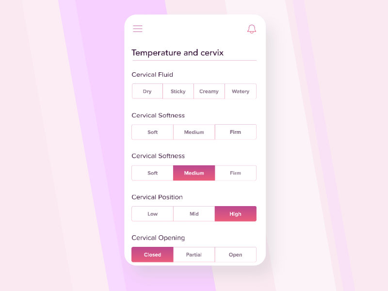
Calendar
 |  |  |
A user fills in the survey every day and can view her historical data on the chart.
Usability Heuristics:
Flexibility and Efficiency of use. A novice user might need more help with a complicated chart while an advanced user may use it as it is. Adding some explanations on what "Luteal Phase", "FAM Rules" mean would make user experience much more smooth.
Everyday survey / dairy
There are no notifications about the necessity to fill in the survey every day and where it can be done in the app. After entering the Data today a user sees a button "Edit" and by pressing it she can fill in the data.
Making it possible to fill in the survey by pressing a button on the home screen would make the experience smoother.
The data can be solved automatically as many users requested in the reviews, and in this case we can avoid adding distracting buttons "Save" and "Cancel". Alternatively, primary and secondary actions in the survey should be differentiated.
Table with the data collected
It is hard to scroll the chart and don't get lost between the rows and the columns. Fixing the first column of the table would make tracking come multiple metrics much easier.
THANK YOU
Conclusion
The application is useful and currently is widely used all over the world. It could be redesigned to make the user flow smoother.
The next step would be to test the changes on test users and continue working on the user flow.
The next step would be to test the changes on test users and continue working on the user flow.
Written by Maria Borysova
All rights for images and videos belong to their authors.
All rights for images and videos belong to their authors.
