EduEnhancement
Feedback sharing application
Overview: problem
It is hard to make English learning process in big companies complete and fully transparent. Often business managers and HRs do not see the results of the English learning lessons and can not understand if the money spent on the extra lessons was spent well and how each colleague performs.
The goal of the app is to solve this problem and create an instrument to make English studying easy and accessible for every employee and monitor the progress of each colleague. The app should make reporting of the budget spent on English classes easier and faster.
The goal of the app is to solve this problem and create an instrument to make English studying easy and accessible for every employee and monitor the progress of each colleague. The app should make reporting of the budget spent on English classes easier and faster.
Effective Feedback Process
Start
We found out that many professors being able to test the application are still not interested in using it. Mostly, they were not interested in improving the lessons based on the feedback after each lesson or once a week. The normal review process in universities includes professor's reviews every 6 months. Based on these reviews, professors are either rewarded or fired.
The target audience interested in making studying better is university management. On the other side, students also want to be able to influence the studying process and give feedback to professors.
Users
The application will be used by students, 16-26 years old, mostly, and professors, 24+ years old.
Art direction
General aesthetics
Colors: green, salad, blue.
The application should be friendly and bright to motivate students use it, and simple enough for professors of all ages to understand how to analyze the data they get in the app.
I studied competitors and created a moodboard (a part of it is presented) for a founder to study.
 |
After a few interviews with a founder and discussion of the design styles he prefers, we decided to use bright green and vivid salad colors.
 |
Product design
Onboarding:
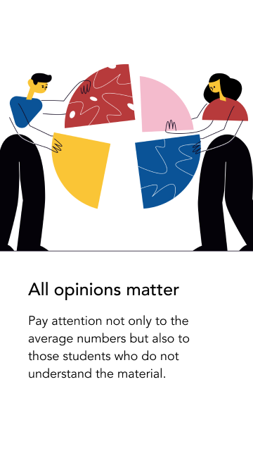
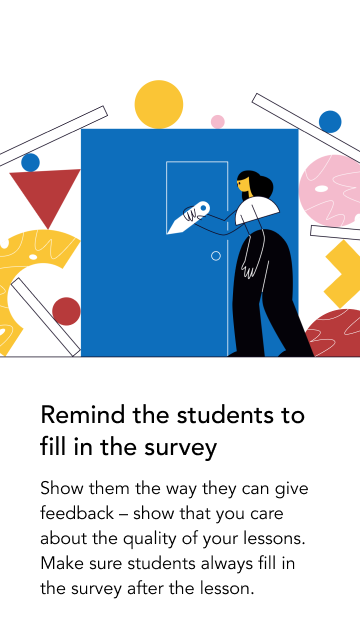
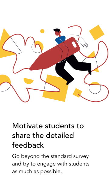
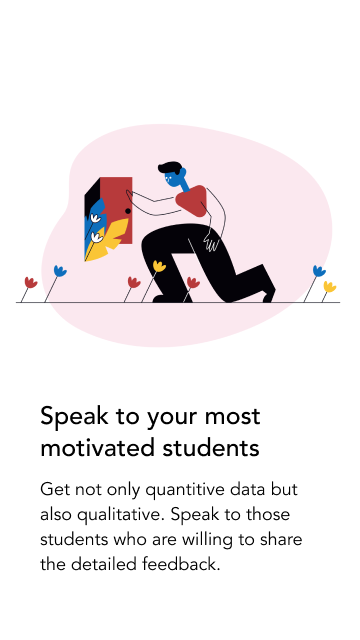
Previously, the app did not have any onboarding. Yet having gathered the feedback from users, we understood that the app's functions require explanation and many charts need some intro. That is why I created a few intro screens for newbies and a set of reminders and best practices for professors to
Previously, the app did not have any onboarding. Yet having gathered the feedback from users, we understood that the app's functions require explanation and many charts need some intro. That is why I created a few intro screens for newbies and a set of reminders and best practices for professors to
Student survey:
Redesigning student survey to make it look more modern, clean and appealing to students.
Redesigning student survey to make it look more modern, clean and appealing to students.
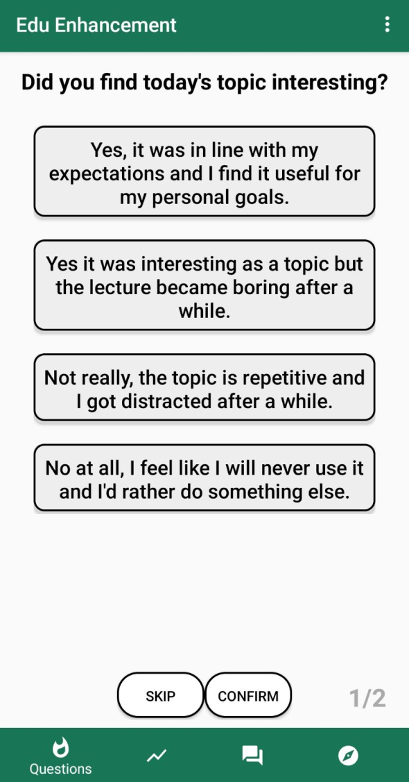
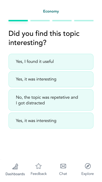
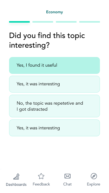
Old design VS New Design
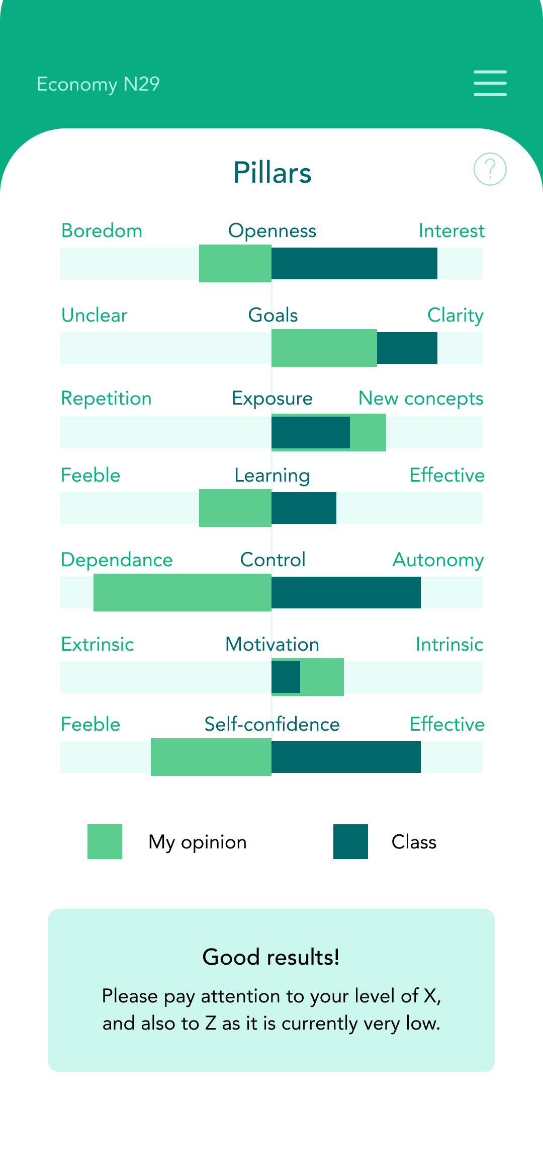
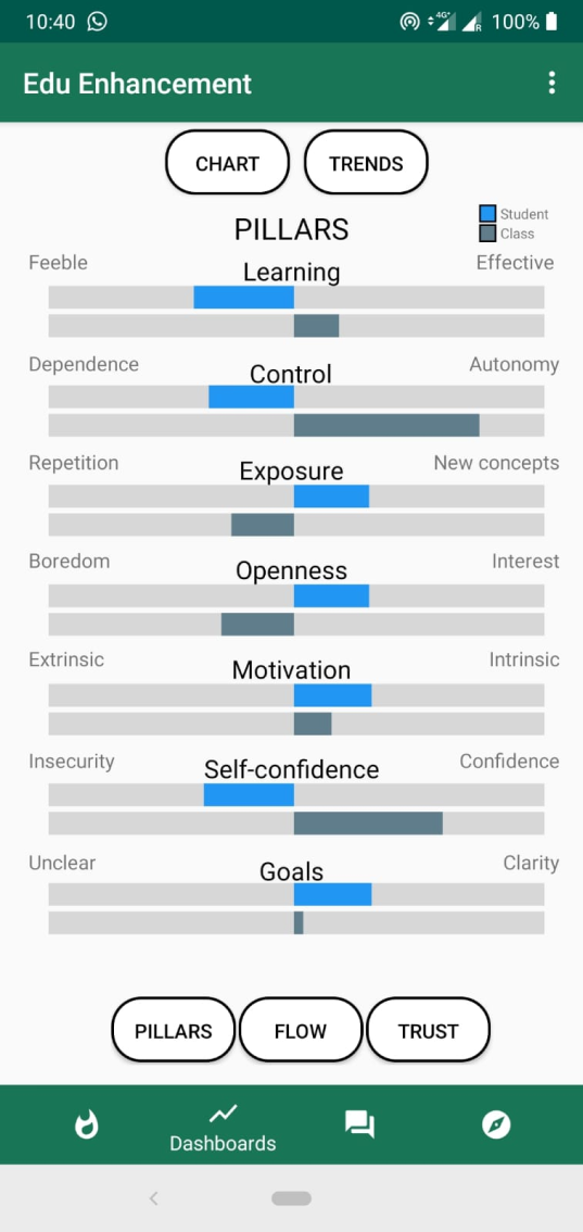
Edu pillars:
Pillars of education allow professors to understand how their opinion about certain aspects of education differs from the opinion of the class.
I erased the number of lines and allowed to see the difference in opinions on the same line, simplifying the chart and making scanning faster.
Apart from that, I added the number of the class at the top and added a quick summary with the conclusions from the chart for those who do not want to dig deep in the stats.
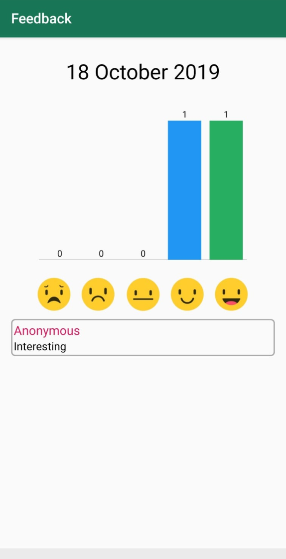
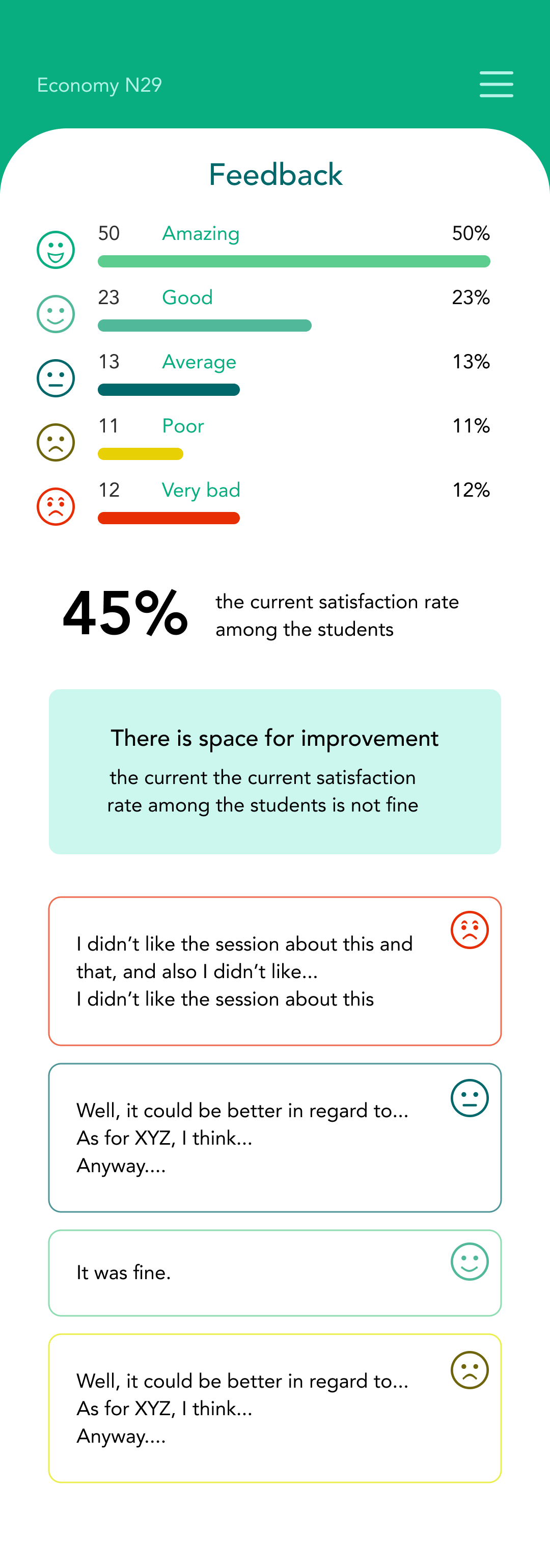
Feedback:
At the end of some classes students are filling in a short form and have an ability to give a text feedback to a professor.
We decided to show not only the total number of good or bad reviews but also to show the percentage of 5-star, 4-star, 3-star reviews. It is easier to understand how many great reviews a user got by looking at the relative number than at the absolute one.
For accessibility, I added smileys AND color indication for the reviews. By marking the reviews with smileys we shorten the amount of time needed to find the bad/the best reviews professors use the most. These reviews are the most illustrative as they highlight "the edge cases", the best and the worst part of the education process.
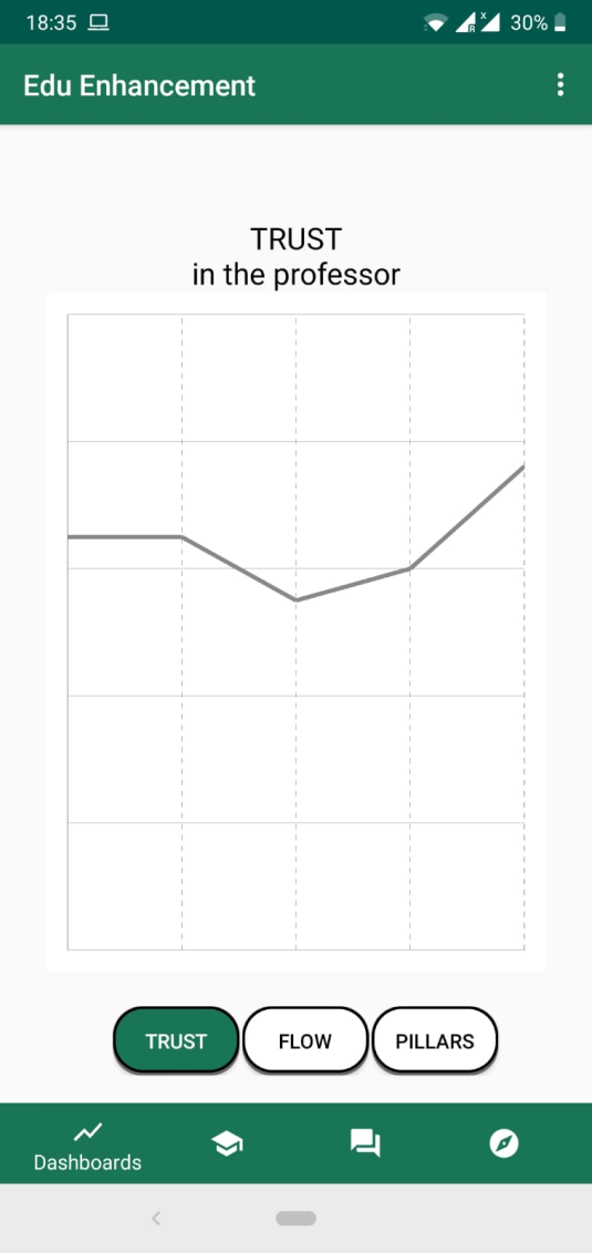
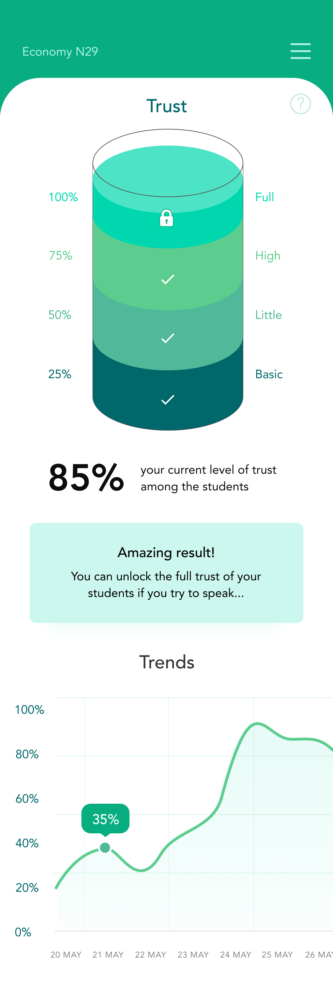
Trust:
Trusting a professor is a basis of effective learning. If a student does not believe that a professor has enough knowledge, experience and willingness to help, he or she will not listen to him. I decided to use an analogy with a cup, that gets filled in with trust.
Furthermore, I added a chart for professors to see the trend and compare their current results to their previous trust levels.
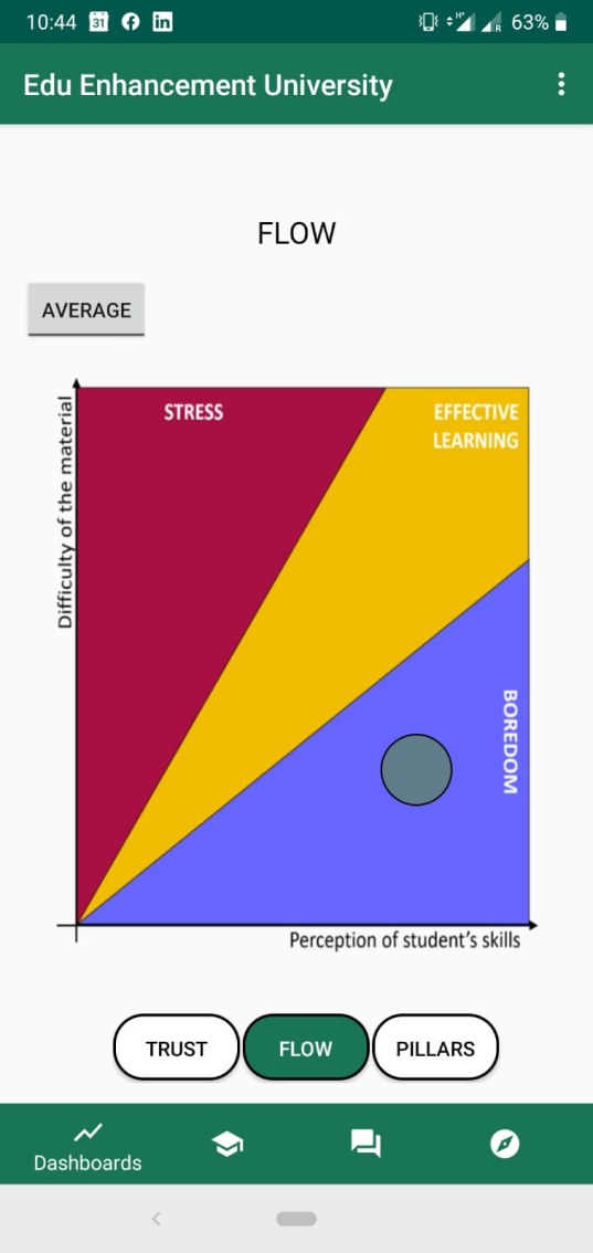
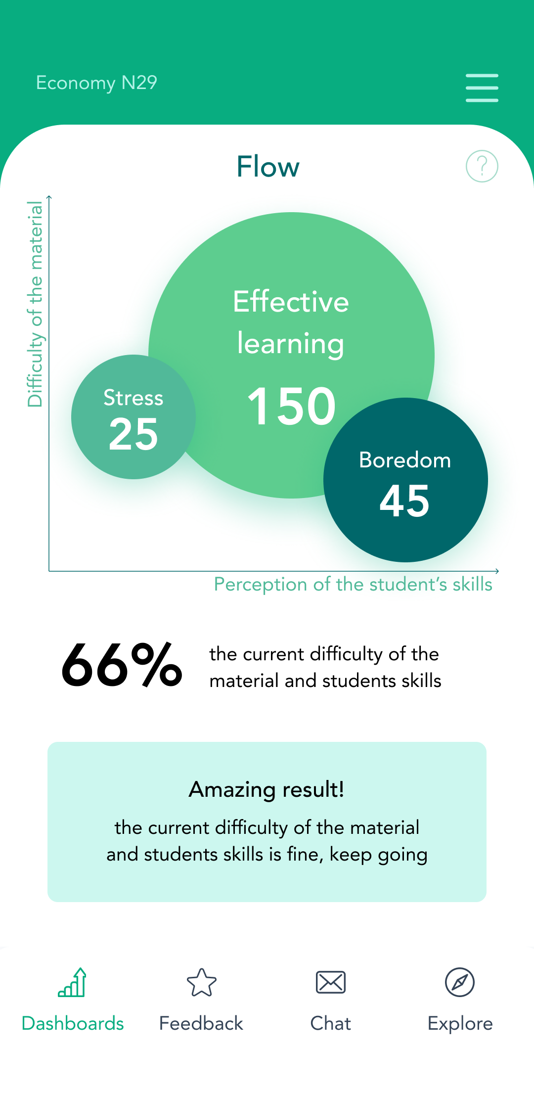
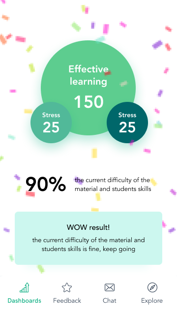
Flow:
One of the most important charts is Flow, showing how difficult or easy learning with a professor is.
Previous chart was hard to understand and most of the respondents during user interviews did not see how they can benefit from it. I have chosen the bubbles of different sizes to indicate the number of students who have chosen a particular answer.
Again, I added a summary and animation when a professor reaches 90% effective learning mark.
Client says
THANK YOU
Conclusion
My goal was to create a prototype of the application for a founder to be able to test it. The goal was reached, and the app will further be developed by a startup's team.
Written by Maria Borysova
All rights for images and videos belong to their authors.
All rights for images and videos belong to their authors.
